4x3’s direction on enhancing our logo usage, colors and fonts, and graphic elements in our materials has set us on the right path in developing our image. Not to mention, they are a great and easy team to work with! It’s an exciting start for our new venture, and we’re looking forward to continuing the progression of our brand.
Jennifer Cahill
Managing Partner
4x3 was approached by Concinnity to create a complete branding identity that encompasses the innovative and collaborative human and capital connections that Concinnity creates.
As strategic advisors, Concinnity immerses with organizations to accelerate their potential by hand crafting strategies and seamless execution.
More Than Just a Logo
Your brand should extend beyond just what your logo looks like. It is visual elements and verbal language that a company or organization uses paint a picture for the audience, a picture that conveys the culture of the company.
Developing a manual of logo usage, colors, typefaces, and graphic devices are a start; but beyond that, it’s all about building a consistent, cohesive culture around your brand.
Branding Standards
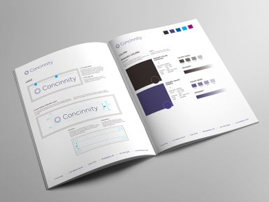
In Phase 1, 4x3 created a Branding Standards Guide for Concinnity.


